Content
Custom Section and Header Decorations: how to change colors and decoration?
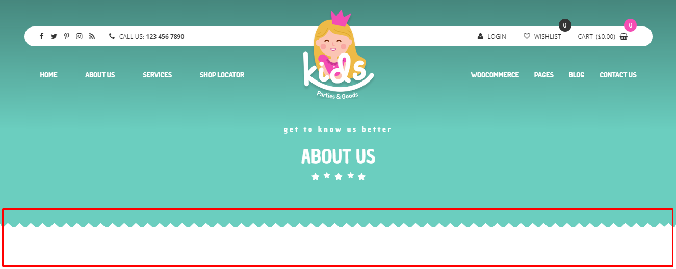
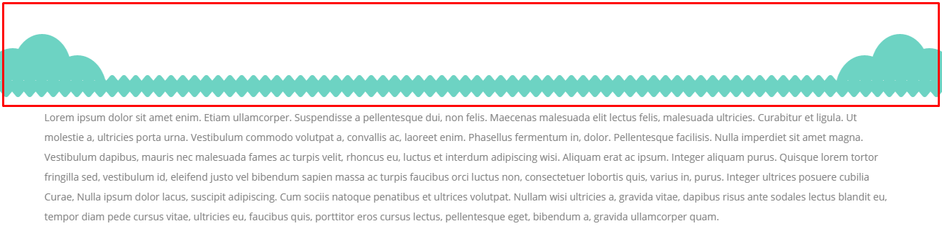
Header Decoration
Decoration type (Customizer)
You can access this options via Customize > Header & Navigation > Header Elements Option chosen in the customizer will work for all the pages that have set Use global customizer settings in Header settings.
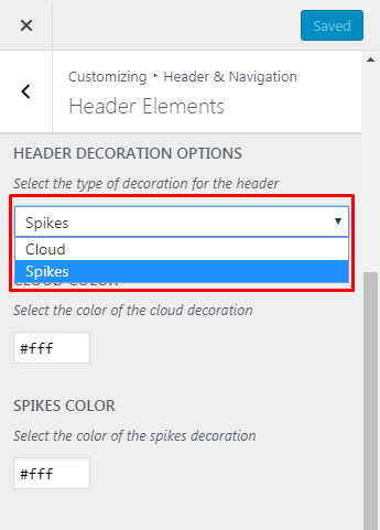
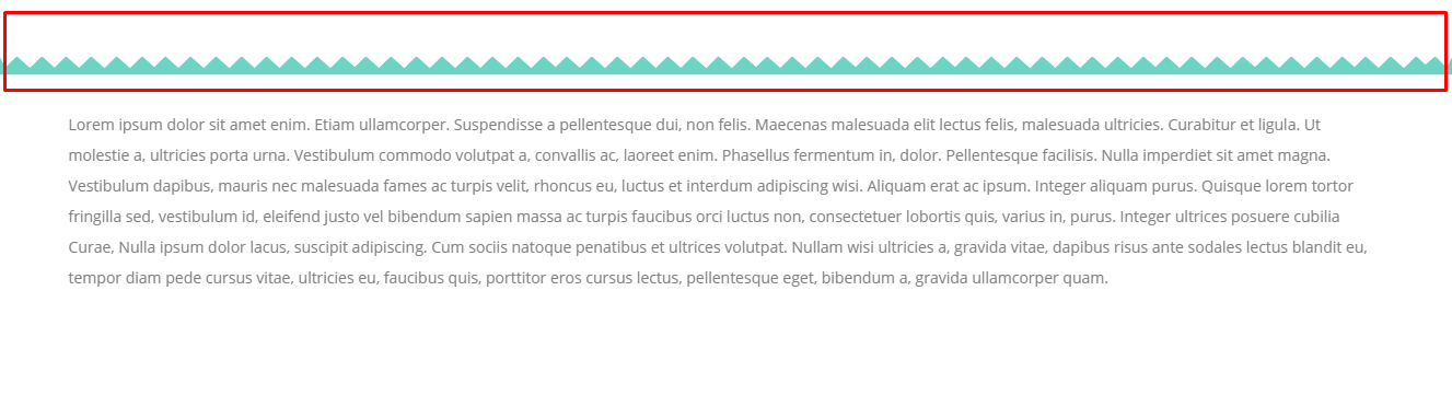
Available header decoration options:
- cloud
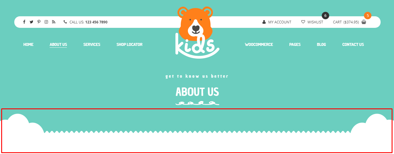
- spikes
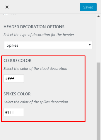
Changing Header Decoration color (Customizer)
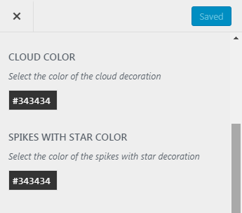
Color of the header decoration can be changed via Customize > Header & Navigation > Header Elements Option using Cloud color and Spikes with stars color option available in the Customizer.
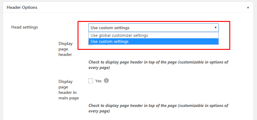
The decoration type of the header can be also set for each page separately. To do so, please go to Pages Add New or choose one already created. At the bottom of the page you will find there section called Header settings. They will allow you to use the decoration set by the Customizer if Use global customizer settings or use a custom settings that can be set for the page you are working on.
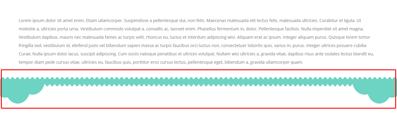
Footer Decoration
Decoration type (Customizer)
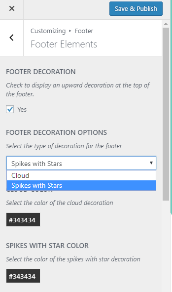
You can access this options via Customizer > Footer > Footer Elements Option.
Available Footer Decoration options:
- cloud
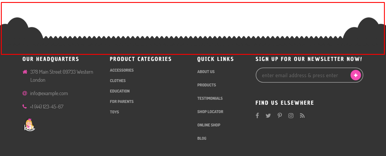
- spikes with stars
Changing Footer Decoration color (Customizer)
Color of the footer decoration can be changed via Customizer > Footer > Footer Elements Option using Cloud color and Spikes with stars color option available in the Customizer.
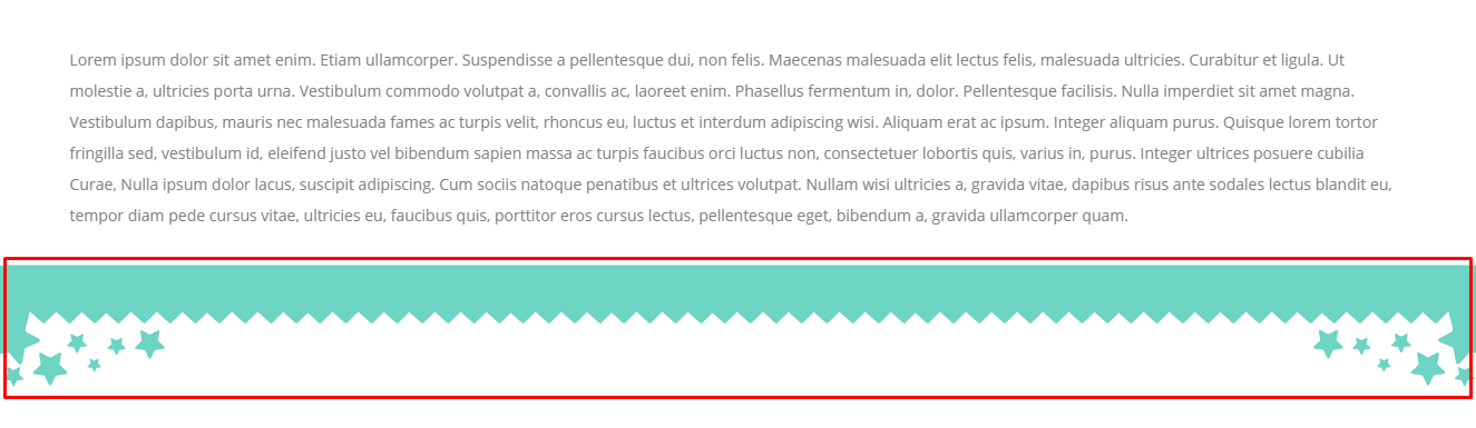
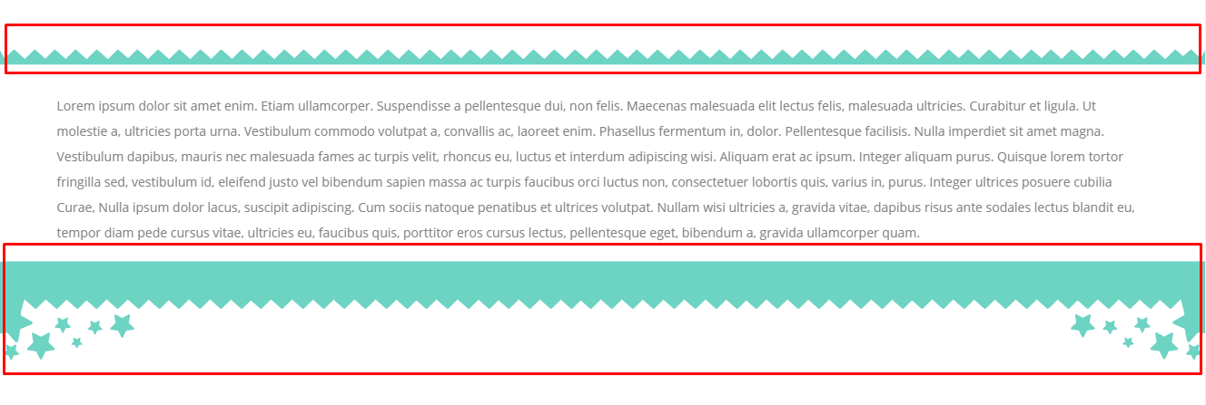
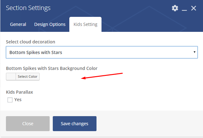
Section Decoration
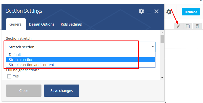
Decoration type (Section Shortcode)
You can access this options in Section Settings shortcode when Section stretch is set to Stretch section or Stretch section and content in General tab.
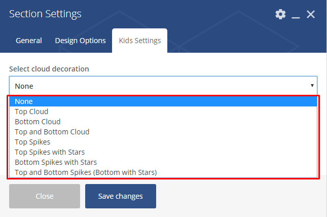
Available Section Decoration options:
- None
- Top Cloud
- Bottom Cloud
- Top and Bottom Cloud
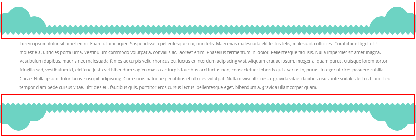
- Top Spikes
- Top Spikes with Stars
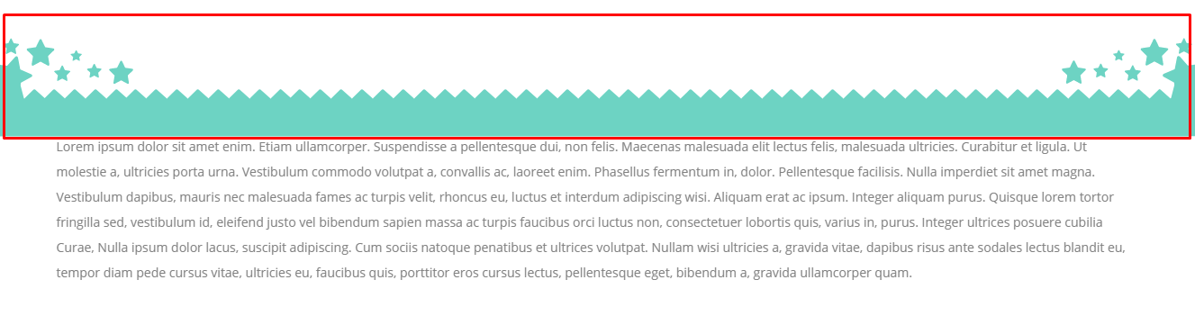
- Bottom Spikes with Stars
- Top and Bottom Spikes (Bottom with Stars)
Changing Section Decoration color (Section Shortcode)
You can access this options in Section’s shortcode via Puer Settings tab.
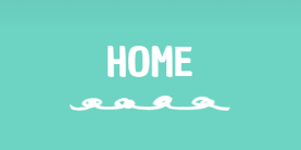
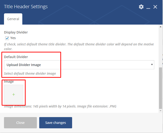
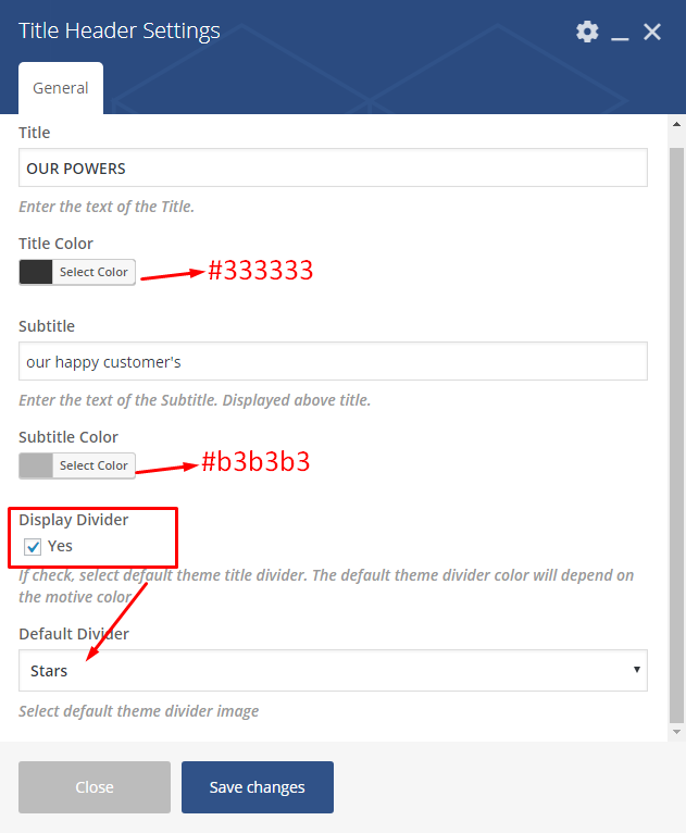
Title Decoration
Decoration type (Customizer)
This option will work for the headers that are set in the page
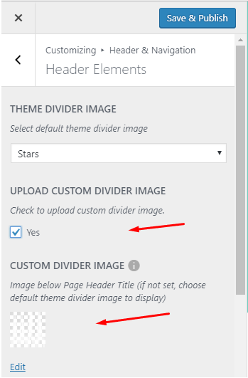
You can access this options via Customizer > Header & Navigation > Header Elements
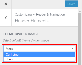
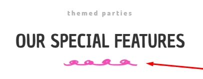
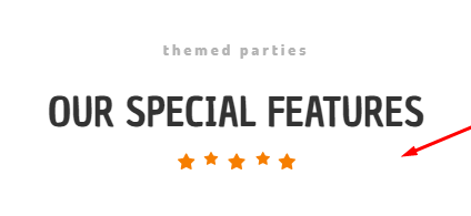
Available Divider Images:
- Curl Lines
- Stars

You can also upload your own custom divider image that will be used instead
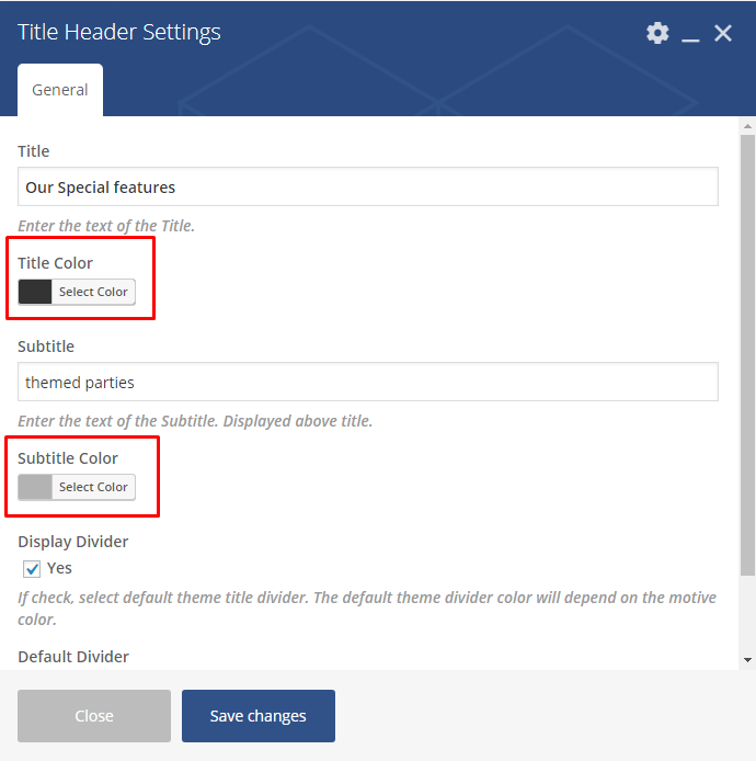
Decoration type (Title Header Shortcode)
This option will work for the titles that are adde via Title Header Shortcode that can be access via Page > Add Element > Puer Tab > Title Header.
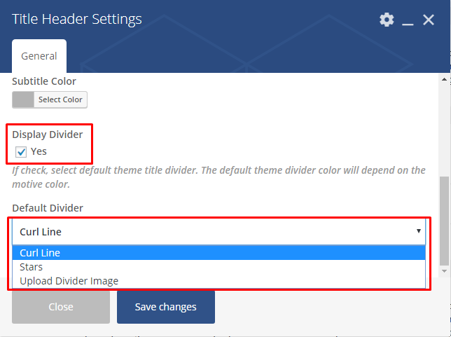
Available Divider Images:
- Curl Lines
- Stars
You can also upload your own custom divider image that will be used instead
Changing Section Decoration color (Title Header Shortcode)
You can change the color of the Title and Subtitle in the Title Header shortcode using Title Color and Subtitle Color options.
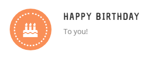
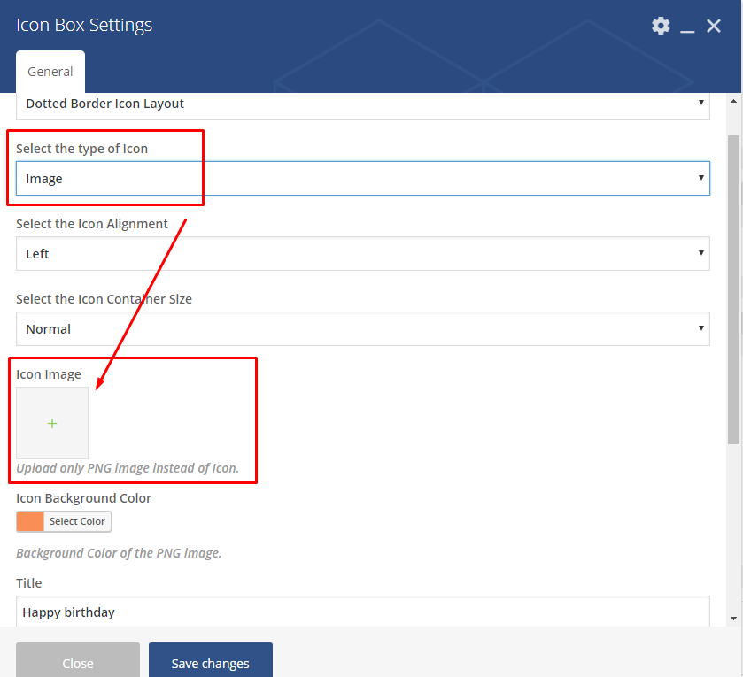
Icon boxes: available types and how to use them?
You can access this options in Icon boxes shortcode that can be access via Page > Add Element > Puer Tab > Icon boxes. With this element have 3 avaliable icon box layouts:
- Default Icon Layout
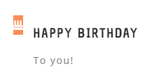
- Solid Border Icon Layout
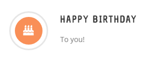
- Dotted Border Icon Layout
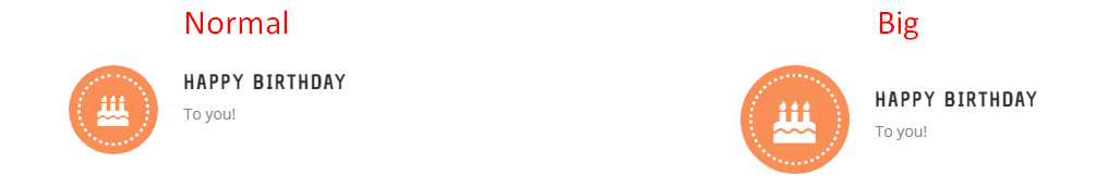
Except the layout you can as well change the size of the Icon Container. The available sizes are:
- Normal
- Big
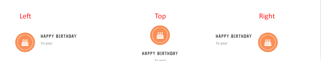
Icon alignment
- Left
- Right
- Top
And type of the Icon
- icon: where you will be able to choose icons from one of available categories
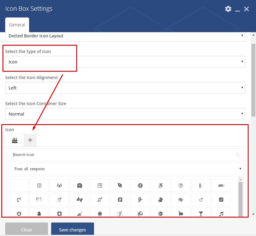
- images: which allow you to use your own custom image for the icon.
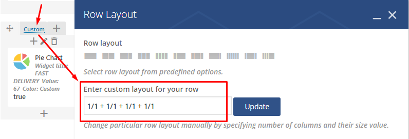
Sliders: available types and how to use them?
Revolution slider
Front-end .. image:: /_images/revolution.png
Have some Question about the slider? Check 10 frequently asked questions.
Back-end .. image:: /_images/revolutionB.png
Post Slider
Front-end .. image:: /_images/pot_sliderF.png
Back-end .. image:: /_images/pot_sliderB.png
All the configuration options are available in slider shortcode settings tab General. Below you will find all the options and short descriptions about them.
Source of the images
Choosing style of the slider
To create your own custom slider you can add Widget title that will be visible above the slider. The next step in creating your own slider is decide which type of slider to use. Avaliable slider types are:
- Flex slider type

- Flex slider slide

- Nivo slider

After choosing the style that will be used for the slider you can decide if you want the slides to move on they own or do not move at all. To choose scroll to Auto rotate and choose the slider movement between 3, 5, 10, 15 seconds or choose disable this option.
Thumbnail size will allow to set the size of the slides. Example: thumbnail, medium, large, full defined by current theme. Alternatively enter image size in pixels: 200x100 (Width x Height).
You can also attached Link to each slide so it will lead to the bigger veersion of the image, post from which the image comes or to a custom link.
Choosing number of sliders visible
Not always we want to show all of the images that are available. To decide about the number of images that will be available in this slider please add number to Slider count option. If for some reason you want to show all the beautiful images in one slider add there Enter “All” to display all slides.
Filter slider images
If the issue is not the number of the slides but which images are used just use one of the filtering options that allow you to indicate which image to use.
To filter images you can use:
- Post/Page IDs: Enter page/posts IDs to display only those records (Note: separate values by commas (,)). Use this field in conjunction with “Post types” field.
- Categories: Enter categories by names to narrow output (Note: only listed categories will be displayed, divide categories with linebreak (Enter)).
Order
When you choose which images to show, you cen decide the order of them by sorting them by: ID, Author, Title and many more.
Adding custom changes
For some reason you don’t like the way how the slider looks like or want to add it more custom look? You can achieve it by adding custom css. You can use one of the slider classes but we would suggest to simply add your own class in Extra class name* to style particular content element differently or Element ID (Note: make sure it is unique and valid according to w3c specification)
Contact Form 7 - contact form and Newsletter form
Note
Newsletter forms are created with use of Contact Form 7 plugin and they will work as any other forms created by this plugin. This forms don’t posses typical newsletter functionality.
If you never before used this plugin I suggest you to check Getting Started with ContactForm 7.
Contact forms in Puer WP are created with the use of Contact Form 7 Plugin. Below you will find information how to recreate Contact forms used in our theme by adding the correct markup in the Mail tab panel.
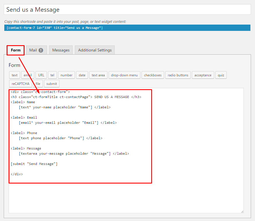
Contact Us Now
Front-end
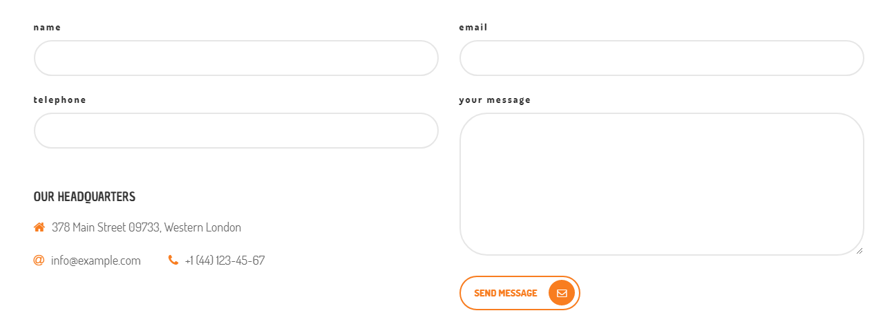
Markup
<div class="row">
<div class="col-md-6">
<label> name </label>
[text* your-name]
<label> telephone </label>
[text* your-number]
<div class="ct-custom-contactInfo">
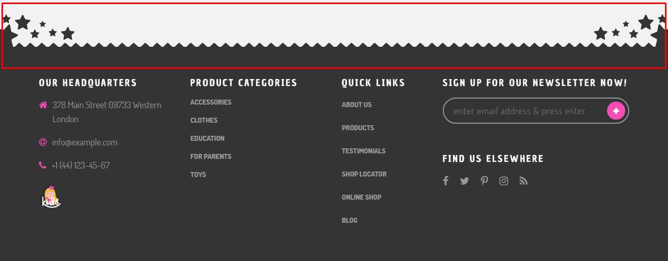
<h4>OUR HEADQUARTERS</h4>
<p><i class="fa fa-home"></i><span>378 Main Street 09733, Western London</span></p>
<p class="col-md-4"><i class="fa fa-at"></i><span>info@example.com</span></p>
<p class="col-md-8"><i class="fa fa-phone"></i><span>+1 (44) 123-45-67</span></p>
</div>
</div>
<div class="col-md-6">
<label> email </label>
[email* your-email]
<label> your message </label>
[textarea your-message id:ct-textarea-smallerHeight]
<button type="submit" class="ct-button-outline ct-submitBtn">Send Message <span class="ct-submitBtn-icon"><i class="fa fa-envelope-o"></i></span></button>
</div>
</div>
Footer Newsletter
Front-end
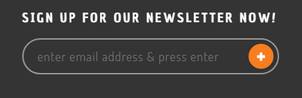
Markup
[email* your-email class:ct-newsletter-footer placeholder "enter email address & press enter"]
[submit class:ct-newsletter-footer-btn ""]
Lets Work Together
Front-end
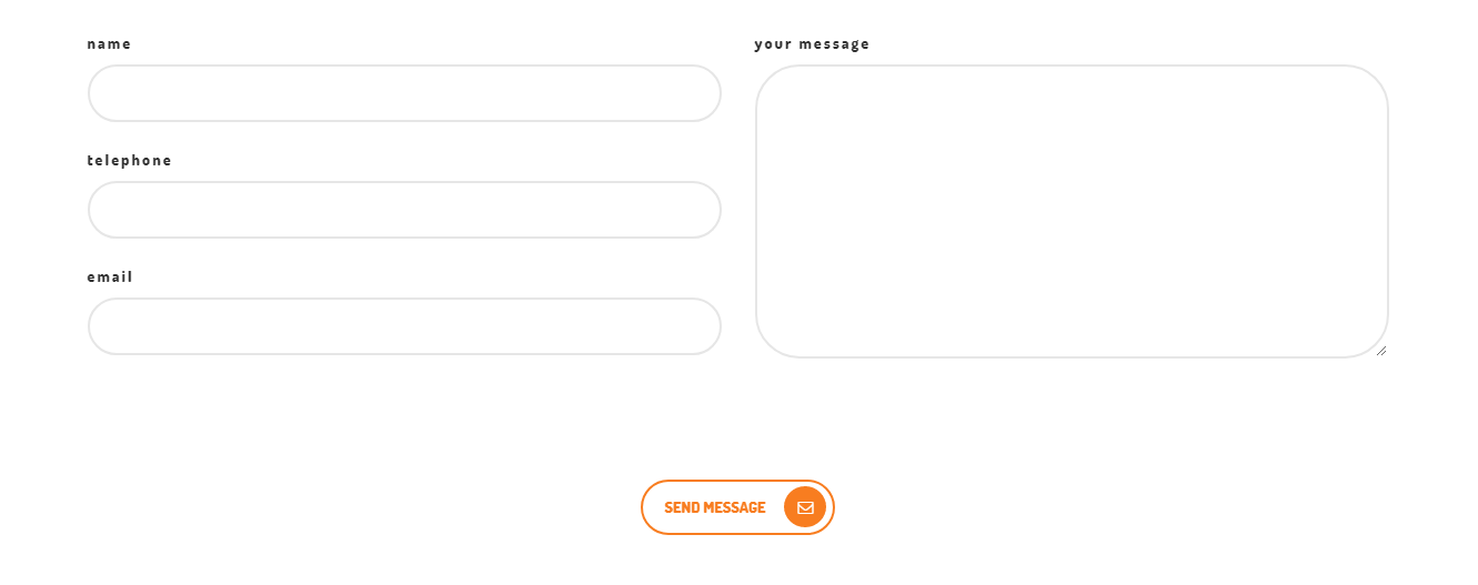
Markup
<div class="row">
   <div class="col-md-12">
      <div class="col-md-6">
         <label> name </label>
                 [text* your-name]
         <label> telephone </label>
                 [text* your-number]
         <label> email </label>
                 [email* your-email]
      </div>
      <div class="col-md-6">
         <label> your message </label>
                 [textarea your-message]
      </div>
   </div>
   <div class="col-md-12 text-center ct-button-lower">
      <button type="submit" class="ct-button-outline ct-submitBtn">Send Message <span class="ct-submitBtn-icon"><i class="fa fa-envelope-o"></i></span></button>
   </div>
</div>
Newsletter
Front-end
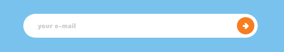
Markup
[email* your-email class:ct-cta-newsletter placeholder "your e-mail"]
[submit class:ct-cta-newsletter ""]
WC Newsletter
Front-end
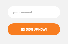
Markup
[email* your-email class:ct-wc-newsletter placeholder "your e-mail"]
<button type="submit" id="ct-wc-newsletter-btn" class="ct-button-solid">
<i class="fa fa-envelope"></i> SIGN UP NOW!</button>
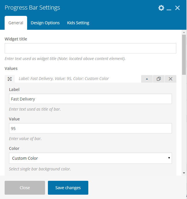
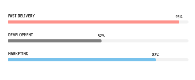
Progress Bars - how to change values, labels and colors?
Progress Bars on the page are set via Progress Bar shortcode.
Back-end

Front-end
Values, Color and Label for this elements can be set via General Tab by clicking + to create new progress bar and then choosing Toggle bar arrow
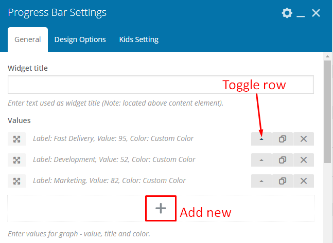
In Values section you will find option to choose pogress bar’s:
- value
- label
- color
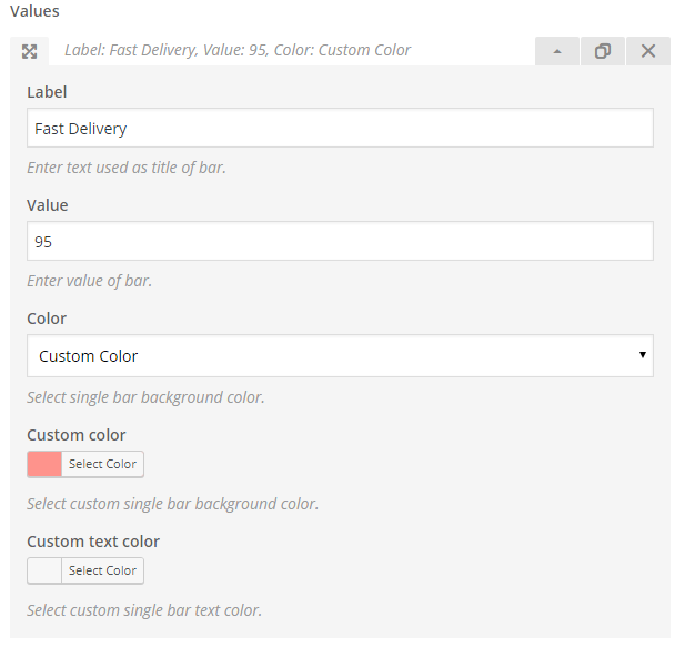
The other way to change color of all of the progress bar added via shortcode is to go to Puer Setting tab and choosing Puer Progress Bar. If checked, the progress bar will be set to the theme style.
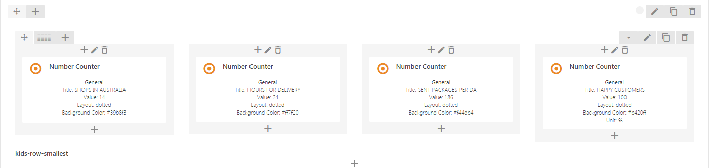
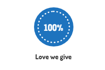
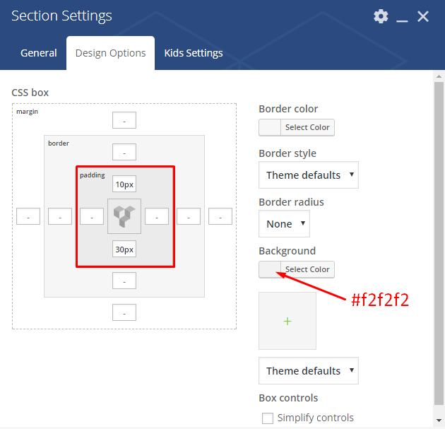
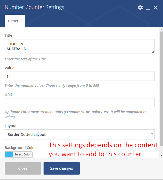
Number Counter - how to change values, labels and colors?
Number Counter on the page are set via Number Counter shortcode.
Back-end
Front-end
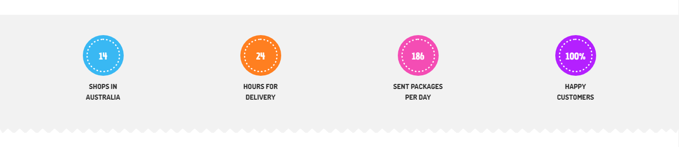
There are two layout available fort this shortcode:
- Border Solid Layout
- Border Dotted Layout
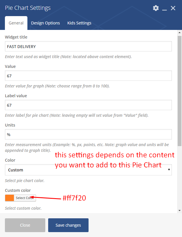
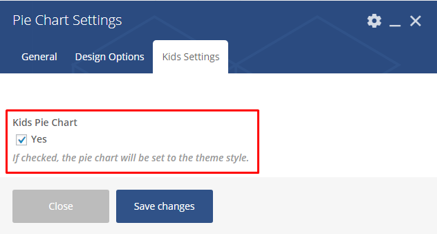
Pie Chart - how to change values, labels and colors?
Pie Charts on the page are set via Pie Charts shortcode.
Back-end
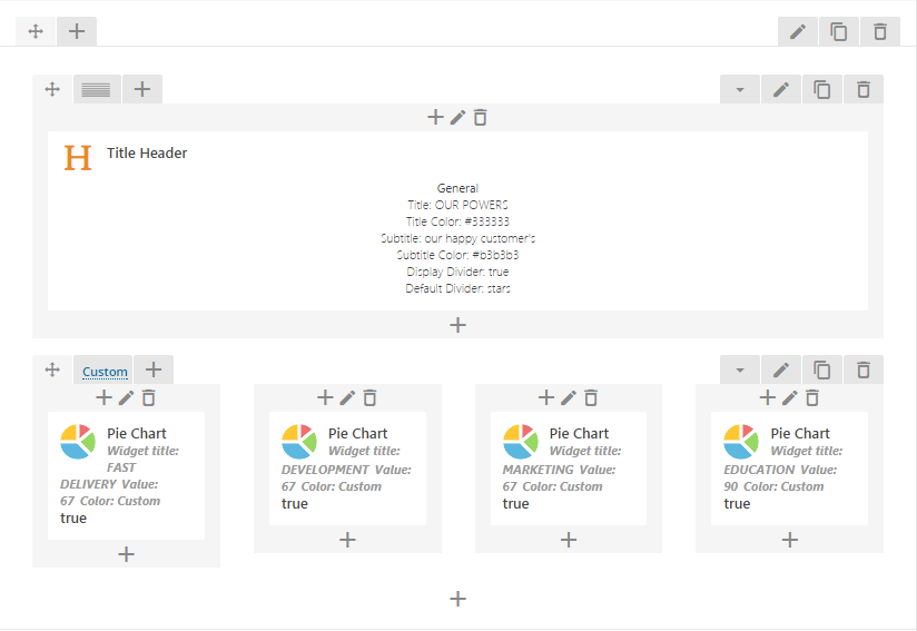
Front-end
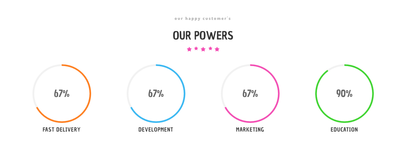
Recreating the demo look
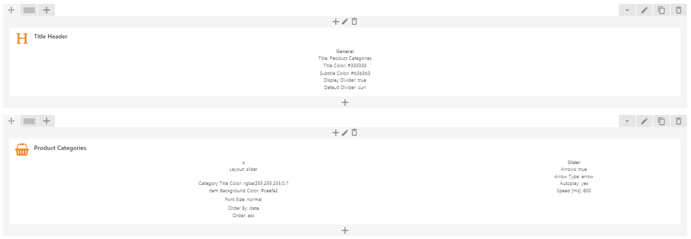
Below we are showing all the settings that create this look.
Creating Header section
Creating Pie Chart section
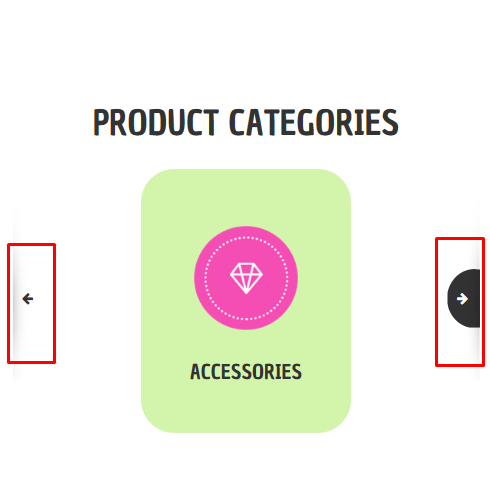
Product Categories Element
Showing the categories of the products available.
Back-end
Front-end
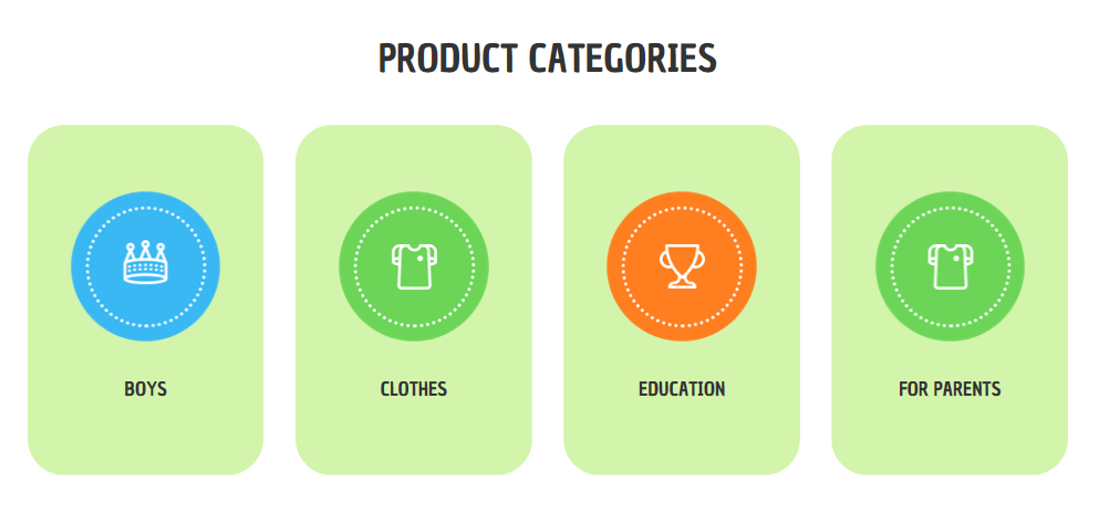
This element have 2 options for its arrow navigation.
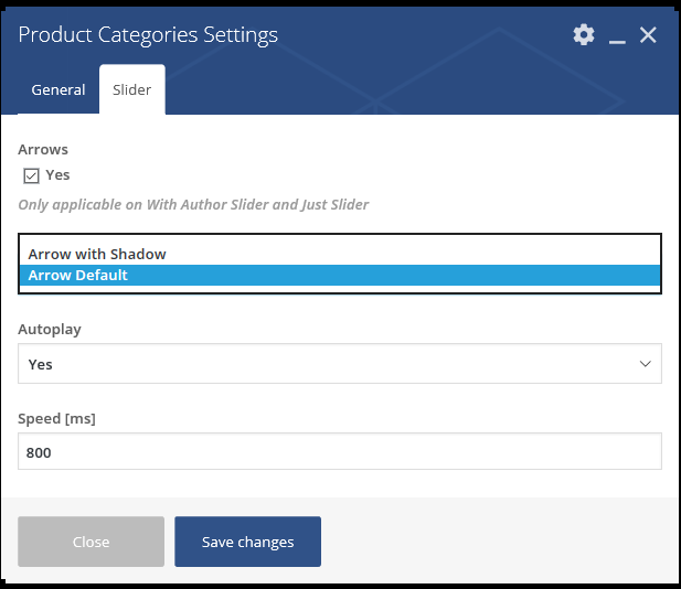
Arrow Default
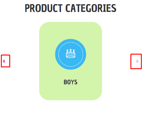
Arrow with Shadow